BMW and Mercedes are about to do something they don’t do often—launch rival cars at around the same time. It’s unusual when car companies have the same model life cycles, as different brands have different plans. However, the new 5 Series and new E-Class are about to launch at around the same time, later this year. Ahead of the E-Class’ launch, Mercedes revealed its interior to give potential customers a taste of what’s to come. While we don’t know exactly what the new 5 Series will look like, we can make an educated guess to see how well these cars are going to compare.
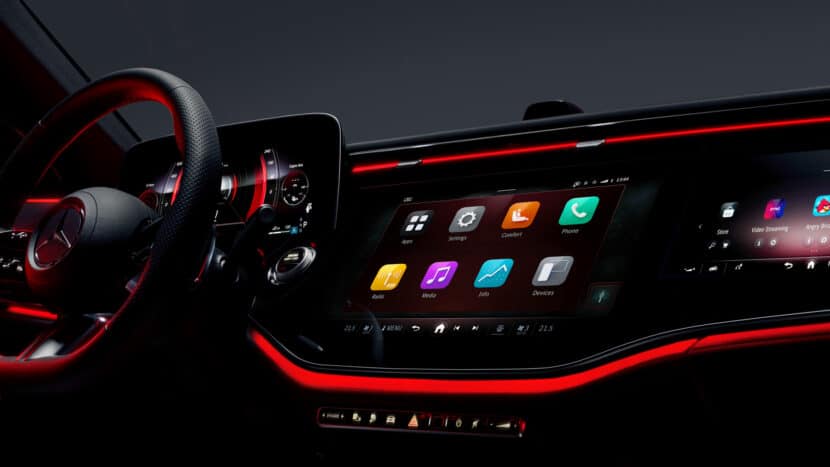
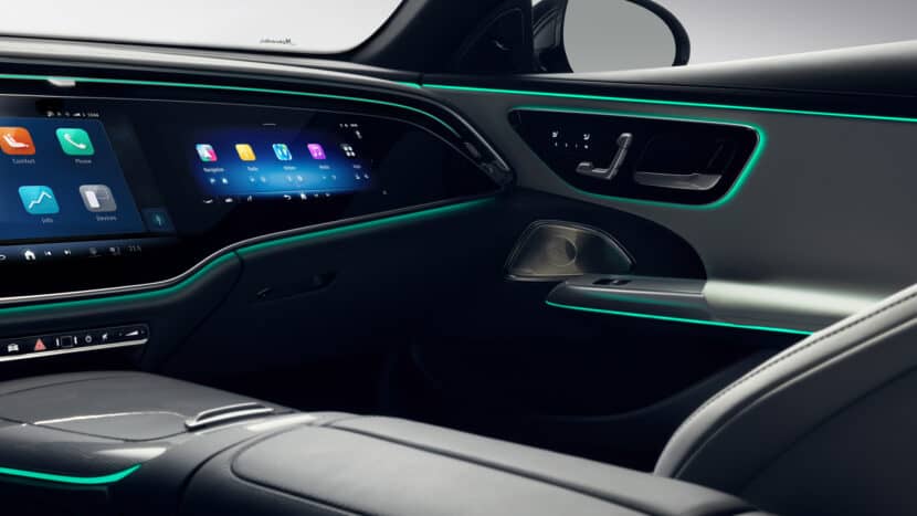
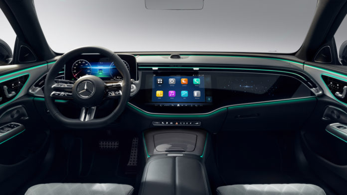
One look at the new E-Class cabin and it’s immediately evident that Mercedes is all-in on the Hyperscreen. The Hyperscreen is Mercedes’ massive new infotainment screen that spans the entirety of the dashboard. However, while it seems like one giant screen, it’s actually one giant housing with two screens inside. The main screen features the normal infotainment system, which seems to have a new UI design that feels like Apple CarPlay, with large, easy to click icons. There’s also a second optional screen just ahead of the passenger, which can control media and phone functions, as well as even play games like Angry Birds (way to be with the times, Mercedes).

Ahead of the driver is a new digital gauge screen, which can feature a few different graphic designs. There are futuristic looking gauges and old-school gauges, so driver’s can customize it the way they want. The last-gen system was already more customizable than BMW’s iDrive 8, so it would stand to reason that this new one will be even more customizable.
Compared to BMW’s dual curved screen in iDrive 8-equipped cars, this is far more intense. Mercedes’ new Hyperscreen has just on additional screen but that’s really all it needs to feel absolutely massive. BMW’s looks far less in your face, which is a good thing for most enthusiasts. It’s just a simple curved screen that has the gauge screen and infotainment screen built in. Neither of which are as large as their Mercedes counterparts.

However, in terms of functionality and capability, Mercedes’ Hyperscreen seems quite a bit more advanced than iDrive 8. The graphics are more vibrant, it features more customization, and there are just more functions, such as certain games and even TikTok and Zoom chats.
As for the rest of the cabin, the actual stuff you can feel and touch, the E-Class looks like… a Mercedes. It has the same corporate steering wheel as everything else now, similar door cards and handles, and a very plain looking center console. It looks fine, and is probably of the highest quality, but it’s a bit bland aside from the screen.
Will BMW’s 5 Series be able to top this? It’s tough to tell. We know the new 5 Series is going to have a more understated than other models, as BMW is trying to keep the 5er a bit more mature than cars like the 7 Series. However, I think we’ll still see remnants of the 7 Series cabin in the 5 Series. So we’ll likely see the illuminated trim, just maybe less of it. It also likely won’t have all the fancy metal and wood work found inside the 7 Series. However, expect the design language itself to be similar, just toned down. If that’s the case, the 5 Series can definitely top the new E-Class if done right. Mercedes was always known for gorgeous cabins but this E-Class interior is just one gigantic screen and really isn’t very nice to look at.
[Images: Mercedes-Benz Press Room]

