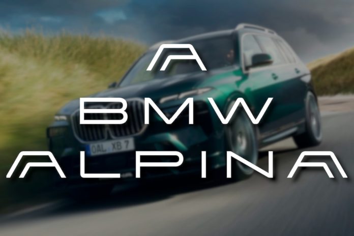
Back to the logos, though. The entire Alpina name is now much thinner than before, but it’s really obvious the new logo isn’t a complete redesign as much as it is a re-imagination of the old logo with the elongated lettering still there. The A is the most interesting part though.
We’re interested to see just how all of this will be used. We can imagine the new Alpina logo will replace the logo normally found on the front of its cars, and perhaps the single A will become a calling card, potentially being incorporated into the BMW logo itself to further help to set the cars apart. The cascading name of A BMW ALPINA then has us thinking it could be used on press releases and the like, or perhaps even inscribed onto cars in nondescript areas.

