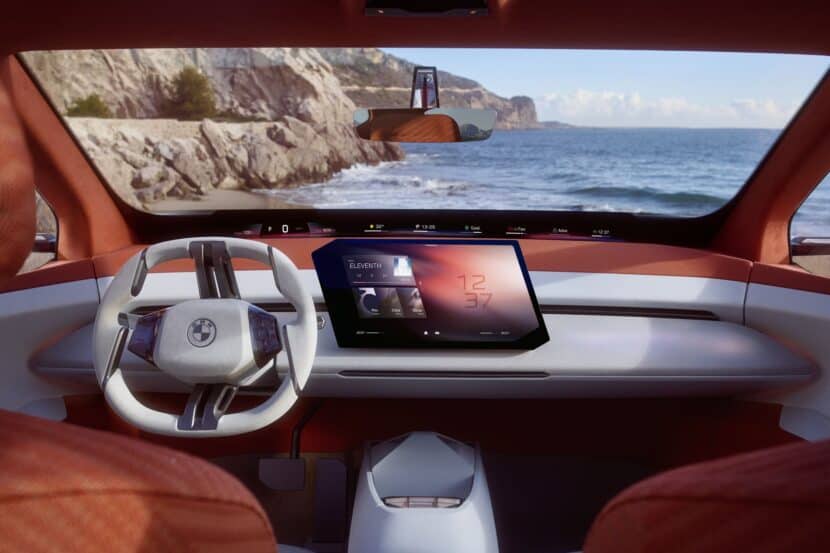
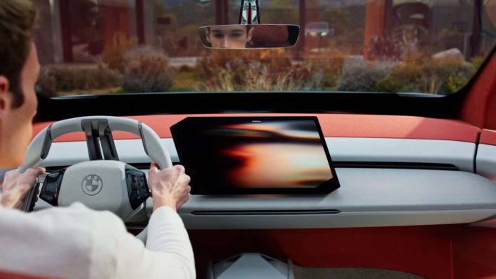
This week’s headline news featured the unveiling of the BMW Vision Neue Klasse X, a concept car that not only foretells the future BMW iX3 but introduces a fresh design language. Mirroring the Vision Neue Klasse Sedan—I’m still getting used to these long naming conventions—this new electric concept brings a new aesthetic direction for the brand. The two distinct designs suggest a significant divergence between sedans, compact cars, and crossovers/SUVs. Additionally, the interior boasts a new design language, highlighted by a uniquely-shaped central touchscreen and the debut of the Panoramic Display.
Same Screen Coming To Other BMWs

We’ve discovered that the display, extending across the entire windshield, will be adopted by other BMW models. Surprisingly, the central touchscreen will follow suit, and sooner than anticipated, according to sources. The upcoming G45 BMW X3 will be the sole exception, lacking this feature until its facelift, as it straddles two development cycles. However, future models, such as the G65 X5 and G50 3 Series, as well as updates to current models like the 5 Series and 7 Series, will incorporate the new touchscreen.
iDrive X Likely The Name

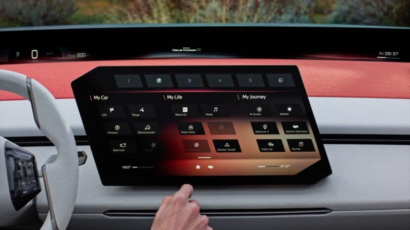
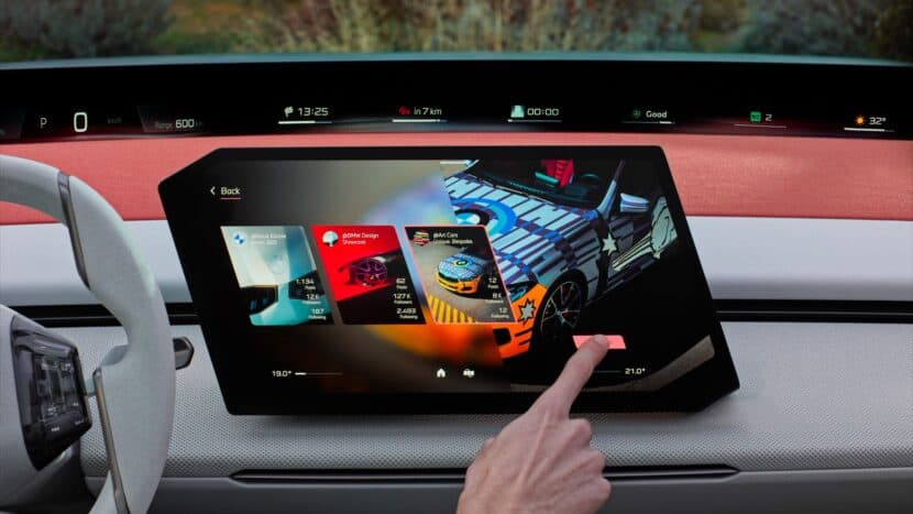
This implies the iDrive X system (unconfirmed name but likely) will drive these new screens. Having demoed and interacted with the system, it’s a notable upgrade from iDrive 8.5 and 9 in terms of interaction, speed, and ease of use. However, this transition might mean the phase-out of the traditional iDrive controller in favor of an added touchpad/controller on the steering wheel, serving as the new iDrive interface. The effectiveness of this new haptic control scheme, differing significantly from the current iDrive knob’s twist and push functionality, is yet to be determined, as it will radically alter user interaction and experience.

Why does this new touchscreen sport such a distinctive shape? We inquired with BMW whether this choice was driven by design or functionality, given it transforms the entire screen interaction relative to the existing infotainment system. The sole similarity lies in the Quick Select feature, which appears to be a pivotal component of the iDrive X’s UI/UX. BMW’s response was straightforward: the decision was mostly design-oriented, aiming to provide customers with a unique offering in the segment that diverges from the tablet-like designs of competitors.
However, it turns out there’s also a functional aspect to the design. The screen’s size, its placement on the dashboard, and its angle all enhance ergonomics compared to current screens. We concur: the screen appears more accessible, especially when stationary, and is positioned to minimize driver distraction. Additionally, compared to the existing curved display, it offers easier access for the passenger to utilize its features.

